Which ideas or emotions have been most present in your work lately? Are you exploring new themes that reflect the current times?
The visual language and themes of my work are deeply connected to my personal lifestyle and outlook on life. My Berm series, inspired by rural verges, emerged during my many cycling and walking trips. From my home in Rotterdam, I often escape the urban hustle to find peace in landscapes where agriculture and nature coexist. In today’s political and social climate, dominated by aggression and unrest, I feel an increasing need for silence and stillness. This is currently expressed in my ongoing autonomous work, which explores monochromatic, subdued colour palettes that evoke serenity.
How does the surrounding space influence your material choices or structural approach when developing a piece?
For commissioned projects, the context of the space plays an important role. The colour palette is often determined in consultation with an interior designer, but I always strive to go beyond simply adopting existing shades. By introducing colour in a considered way, I ensure that the artwork stands out and becomes a strong visual statement within its environment.
Have you recently had the opportunity to create a work with a specific location or type of space in mind, such as a public area, architectural space, or even a hotel?
I am currently working on an installation for the Marina Bay Sands Superyacht in Singapore. The design is based on a smaller piece from my earlier collection, which has been enlarged and adapted to fit a tall niche near a lift passage. At the client’s request, I have subtly integrated gold leaf into the sightlines and movement of the work, creating refined dynamics and light
reflection.
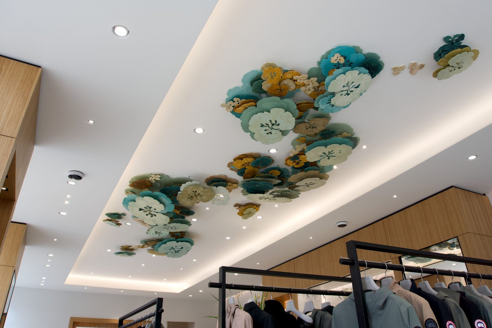
Your work has a distinct visual language that often transforms the environment. How do you see your works contributing to the character or narrative of the spaces they inhabit?
Last year, I created the first suspended version of my Berm series for Canada Goose in Amsterdam. The piece was selected by the curator because of its nature-inspired theme. For the colour composition, I drew inspiration from the shades in the brand’s collections. As Canada Goose is known for warm coats suited for cold climates, I combined warm beige and sand tones with cool turquoise hues from the collection, and added greenish-grey and ochre tones. These contrasts create a harmonious whole that conveys both warmth and freshness, forming a connection between the brand’s identity and the space. My work is not intended solely as an aesthetic object, but also as a means of bringing balance and calm to spaces often characterised by dynamism and functionality. By exploring these contrasts, I aim to create places where people can slow down and pause to appreciate the
beauty of simplicity.